
Graph of the Day: My contribution to PISA Palooza
Posted on December 3, 2013
1
With today’s release of PISA data it is once again time for wild punditry, mass condemnation of U.S. public schools and a renewed sense of urgency to ram through ill-conceived, destructive policies that will make our school system even more different from those breaking the curve on PISA.
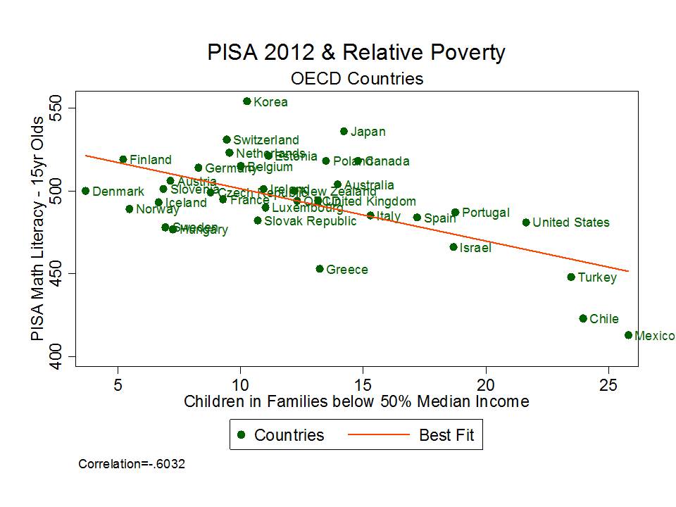
With that out of the way, here’s my little graphic contribution to what has become affectionately known to edu-pundit class as PISA-Palooza. Yep… it’s the ol’ poverty as an excuse graph – well, really it’s just the ol’ poverty in the aggregate just so happens to be pretty strongly associated with test scores in the aggregate – graph… but that’s nowhere near as catchy.
(table M4)
OECD Relative Poverty: Source: Provisional data from OECD Income distribution and poverty database (www.oecd.org/els/social/inequality).
Yep – that’s right… relative poverty – or the share of children in families below 50% of median income – is reasonably strongly associated with Math Literacy PISA scores. And this isn’t even a particularly good measure of actual economic deprivation. Rather, it’s the measure commonly used by OECD and readily available. Nonetheless, at the national aggregate, it serves as a pretty strong correlate of national average performance on PISA.
What our little graph tells us – albeit not really that meaningful – is that if we account (albeit poorly) for child poverty, the U.S. is actually beating the odds. Way to go? (but for that really high