
A few quick thoughts and graphs on Mis-NAEP-ery
Posted on November 8, 2013
0
Yesterday gave us the release of the 2013 NAEP results, which of course brings with it a bunch of ridiculous attempts to cast those results as supporting the reform-du-jour. Most specifically yesterday, the big media buzz was around the gains from 2011 to 2013 which were argued to show that Tennessee and Washington DC are huge outliers – modern miracles – and that because these two settings have placed significant emphasis on teacher evaluation policy – that current trends in teacher evaluation policy are working – that tougher evaluations are the answer to improving student outcomes – not money… not class size… none of that other stuff.
I won’t even get into all of the different things that might be picked up in a supposed swing of test scores at the state level over a 2 year period. Whether 2 year swings are substantive and important or not can certainly be debated (not really), but whether policy implementation can yield a shift in state average test scores in a two year period is perhaps even more suspect.
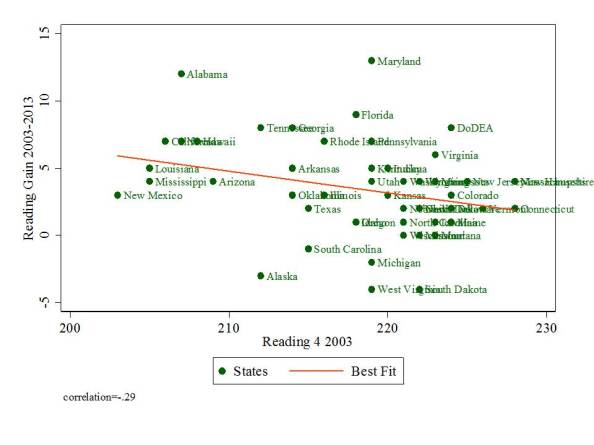
Setting all that aside, let’s just take a step back and look at the NAEP data, changes in scores from 03-13, 09-13 and 11-13 for 4th grade reading and 8th grade math. BUT, as I’ve shown before, since gains on NAEP appear correlated with starting point – lower performing states show higher gains, let’s condition those gains on starting point by representing them in scatterplots against starting